City of Brass follows a similar pattern to many independent games released these days; developers on a hit game break off and form their own studio to start an ambitious project with great ideas behind it. Unfortunately for the team of ex-BioShock devs that crafted City of Brass, this is a recipe for disaster just as much as it is for success. Sadly for City of Brass, it tends towards the side of the scale characterized by stiff controls, frustrating level design, and uninteresting content.
The team at uppercut games clearly had a vision when they first put code to screen here. At its core this is a first-person roguelike. Each run starts in a safe room where players can consume a randomized boon or bane at their own risk. Levels are randomly generated and organized. Characters each have different advantages and disadvantages. There are traps, enemy variety, and a buffet of unlockables. This is a formula that has become somewhat stale over time and City of Brass doesn’t add anything new here to spice up the mix.
Arguably the most interesting change that they attempt is putting the camera in 1st person perspective and tasking the player with two-handed combat. There are different weapon load-outs and items can be picked up and upgraded around the game to change which weapon is in each of the player’s hands. But typically, there’s a melee weapon in one hand and a ranged option in the other. The player can tap either of the shoulder buttons to activate the action for that hand (slashing, whipping, or throwing) to fend off enemies.
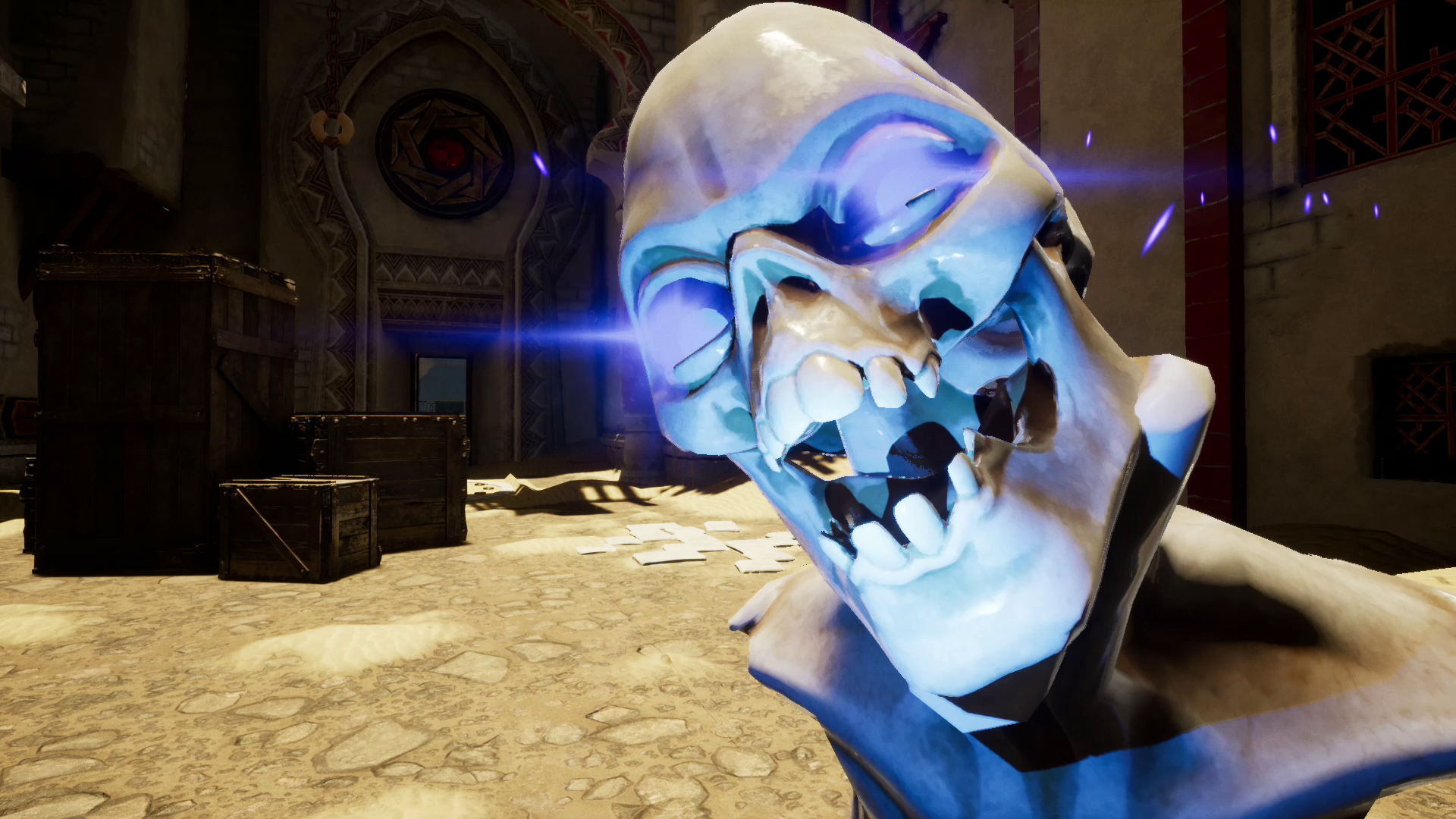
There’s enough variety among enemies to keep the player on their toes. Threats come from all areas and all rangers. There’s your simple melee skeleton, a heavy skeleton, an archer skeleton, a glowing skull that’ll explode if you get too close. Generally, there are lots of different types of defleshed undead that want to make your way to the exit more difficult. Along with enemies traps also attempt to hamper your progress through the maze-like levels. Spiked platforms will severely wound you if you step on them; explosive canisters will ruin your day if you accidentally hit them in the middle of a brawl.
The enemies are fairly standards and uninspired, but the traps are where the inspiration from Bioshock’s combat show’s through and spices things up a bit. In combat, the level itself and the items around you can be your greatest aid in combat. The ability to pick up explosive vases from afar with your whip, fling them at enemies is a simple interaction that never gets old. Likewise leading enemies over a spike trap and triggering it is just one example of a way that turning the tables on your enemy keeps the slashing interesting.
Unfortunately pulling off complex Maneuvers like this is difficult with the wonky controls on Switch that were adapted from Keyboard but not optimized for Switch. Using the Joycons to aim and move felt stiff, and the frame rate seemed much lower than what I had seen in trailers. Overall it makes for a pretty poor gameplay experience.
If I had to peg a reason why it performs so poorly, I’d have to hit the team for optimization. It’s not a graphically or technically demanding title. The visuals are reminiscent of a ps2 game with low-quality 3d models and effects. It doesn’t look bad, but it does look dated.
Ultimately though, if the game played well and compelled me to keep searching through its maze-like levels like the best roguelikes do I wouldn’t care how it looked. In fact, I would probably be much less critical of the lack of enemy and gameplay variety. As it is I can’t recommend shelling out your hard earned cash until the gameplay is significantly smoother and the controls are much tighter.


